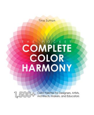
The Pocket Complete Color Harmony - 1,500 Plus Color Palettes for Designers, Artists, Architects, Makers, and Educators by Tina Sutton
Product Details
Web ID: 14061400Your Help with Color Harmony
"The Pocket Complete Color Harmony. 1500 Plus Color Palettes for Designers, Artists, Architects, Makers, and Educators" by Tina Sutton, Quarto Publishing Group - Rockport Publishing, is the abbreviated version of "The Complete Color Harmony" by the same author which was published in 2004. After the introduction the author presents information about topics such as the Color Wheel, the Color Chart, Aspects of Color (hot, cold, warm, cool, light, dark pale, bright), or Basic Color Schemes. The main part of the book is entitled "Moods and Color" (e.g., powerful, romantic, vital, moving, tropical, classic, or subdued). Every mood is introduced with a picture and a brief explanatory text before the corresponding swatches are presented. The swatches are sadly bleared and, especially toward the right side of the charts, they are also faint. Even the outlines for the swatches are fuzzy. The question which arises is if this is only a problem in the ARC which I received or if it is also an issue in the printed copy of the book. I appreciated the chapter about the Psychology of Color and deem the Process Color Chart a great help. Sadly even here the samples are blurry. Nevertheless the book contains good graphic and pictures. It is a great book but the execution could be far better and then subsequently it could be a great tool for the specified target group. The complimentary copy of this book was provided by the publisher through NetGalley free of charge. I was under no obligation to offer a positive review. Opinions expressed in this review are completely my own. #ThePocketCompleteColorHarmony #NetGalley
Recommends this product

Customer review from barnesandnoble.com
handy color guide for artists, designers, and more
This is a nifty little book filled with all kinds of interesting and useful information about color. It starts with a guide to color theory, and includes over 1500 color palettes to spark creativity. Following this is a guide to the psychology of color, which I found very interesting, that will be of great use to designers of all types, artists, advertisers, marketers, etc. A super handy resource in a smaller size than the original, making it easy to carry around with you. Definitely recommended! #ThePocketCompleteColorHarmony #NetGalley
Recommends this product

Customer review from barnesandnoble.com
A Great Introduction to Colors!
An interesting book in which I learnt a lot about colors! I'm fascinated by their significance, their "stories", the way we can/should/do use them, what they do to the brain, and the reader does have information about all of this here! I loved how it was divided, the way it explained things: I'm not an expert, and I understood everything! It was an excellent idea to illustrate it: a book about colors without any colors inside would have been sad! I'd really like to have it on my shelves to dive back into it when I need an information about, say, purple! So, it was a great introduction to colors, how they work (or not!) together, how we can "use" them, what they do to us!
Recommends this product

Customer review from barnesandnoble.com
Helpful informative book on harmonising colors
I love the section that presents 48 swatches of colour combinations for each of the moods or styles like powerful, rich, friendly, fresh, calm, magical and 20 others! (The combinations are categorized as complementary, primary, monochromatic, split complementary, analogous, neutral, clash or split) As an art journaler, I am still learning how to combine harmonious colours that are beautiful expressions of emotions or styles. Overall, a very helpful, informative and gorgeous reference book on colours.
Recommends this product

Customer review from barnesandnoble.com

